Our Brand
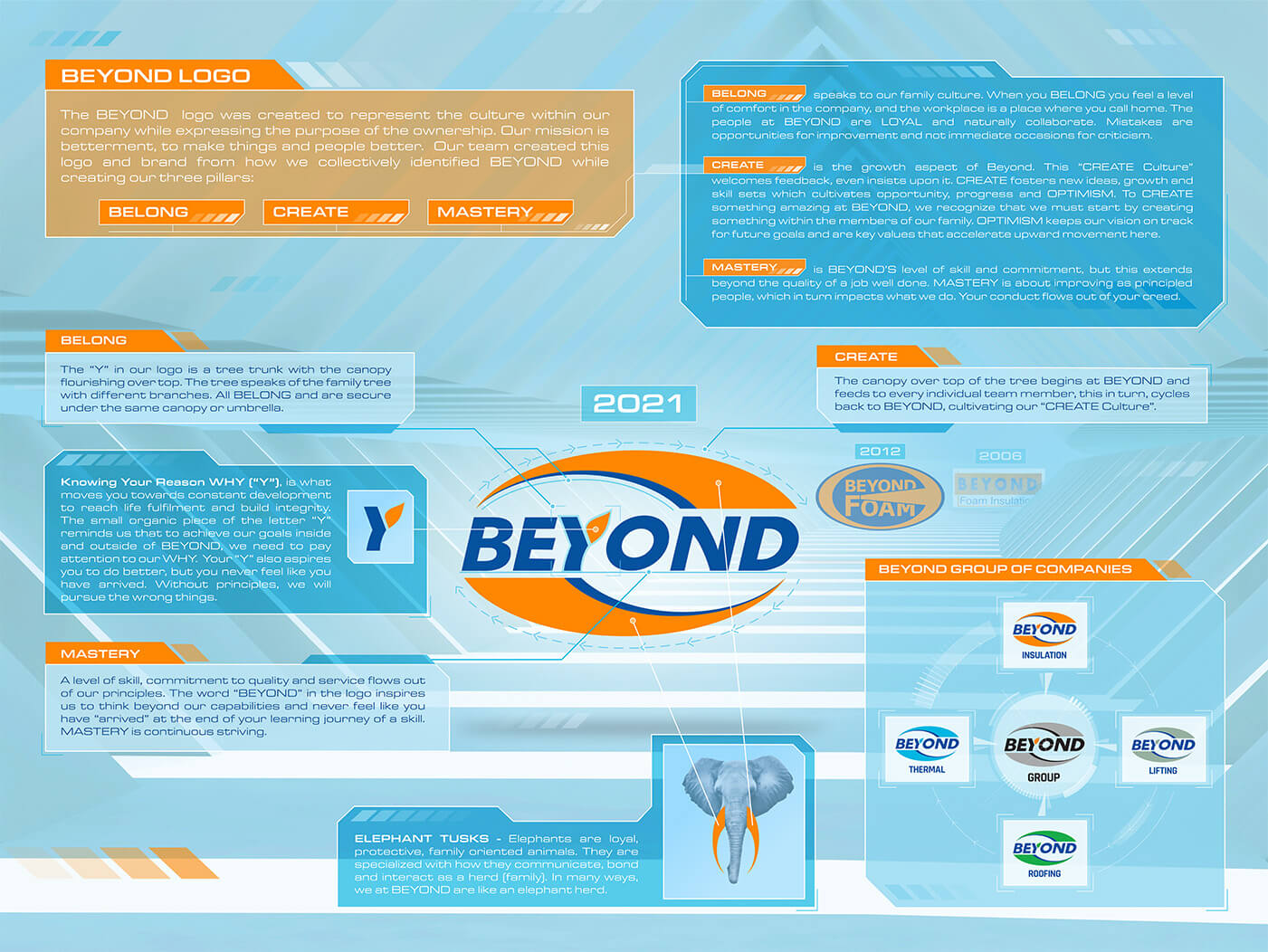
Beyond: Belong, Create, Mastery
Brand Forensics
Already knowing “family” was a big part of who are are, the Beyond family all got together to discuss more of “who we are” and came up with many words that described us. Having been in business since 2006, and having some long time employees, we had a pretty good idea, but needed to distill and unfilter the all words that came to mind when we thought of Beyond- a few thousand sticky notes ought to cover it. Luckily, there were many duplicate words, which clearly started to reveal the depth of our identity.
Extracting all those words took some time and effort. We then needed to unwrap the words to put meaning to them in relation to the Beyond family, business and customers. This all gave us a great foundation to rebuilding what our brand was and what it has become, and we knew it was crucial to deduce this before proceeding to the symbol of our brand, our logo.
Visual Identity
It was time to start compiling all our thoughts and words, and build the visual identity we felt represented who Beyond Group is and how we want customers to think and feel when they see our logo. Through this process, we found that the words Belong, Create and Mastery were our foundational words, or our 3 pillars, and that they best represented us in everything we do and say, as well as consistently represent us in all our visuals and verbal communication. Having a strong logo that represents us well gives us an anchor that reminds us of our brand and what it represents when we speak with customers or when designing our visuals.
Our marketing team and senior management met and sketched and met and sketched… until we had something that touched on all our pillars, was memorable and looked impressive. We put a lot of thought into a final design that worked for all the divisions, We then revealed it internally and then to the world. We love our logo and so do our customers.
The Beyond brand is not an image, a logo, a font or colours. While these are elements of a brand, our brand is something bigger and much more treasured. It’s the synergy of all our actions and the decisions we make every day with the intent to be recognised as trustworthy and the best at what we do. It represents our integrity, our intention, our products, our services and the quality results we deliver time after time. Our brand shines through in all our interactions.
Also see the video that animates our logo and brand story, and how it has evolved since 2006. Please like, share and comment with your thoughts on how you experience our new brand. We would love to hear from you! Contact
Author: Kevin Boschee